Stoneking Design was started in 2016, but I didn't have a clear vision on who or what market I wanted to serve. With the Covid-19 isolations in place, I decided it was time to give my beloved business a rebrand.
During the rebranding process I've come to realize that I love doing collateral design, making multiple pieces that all work together to bring awareness to an event or brand, specifically creating marketing materials for trade shows and fundraisers. With this new outlook I decided to create a brand that was professional, clean, approachable, and of course creative.
I am in love with the final outcome, and I hope you enjoy it too!
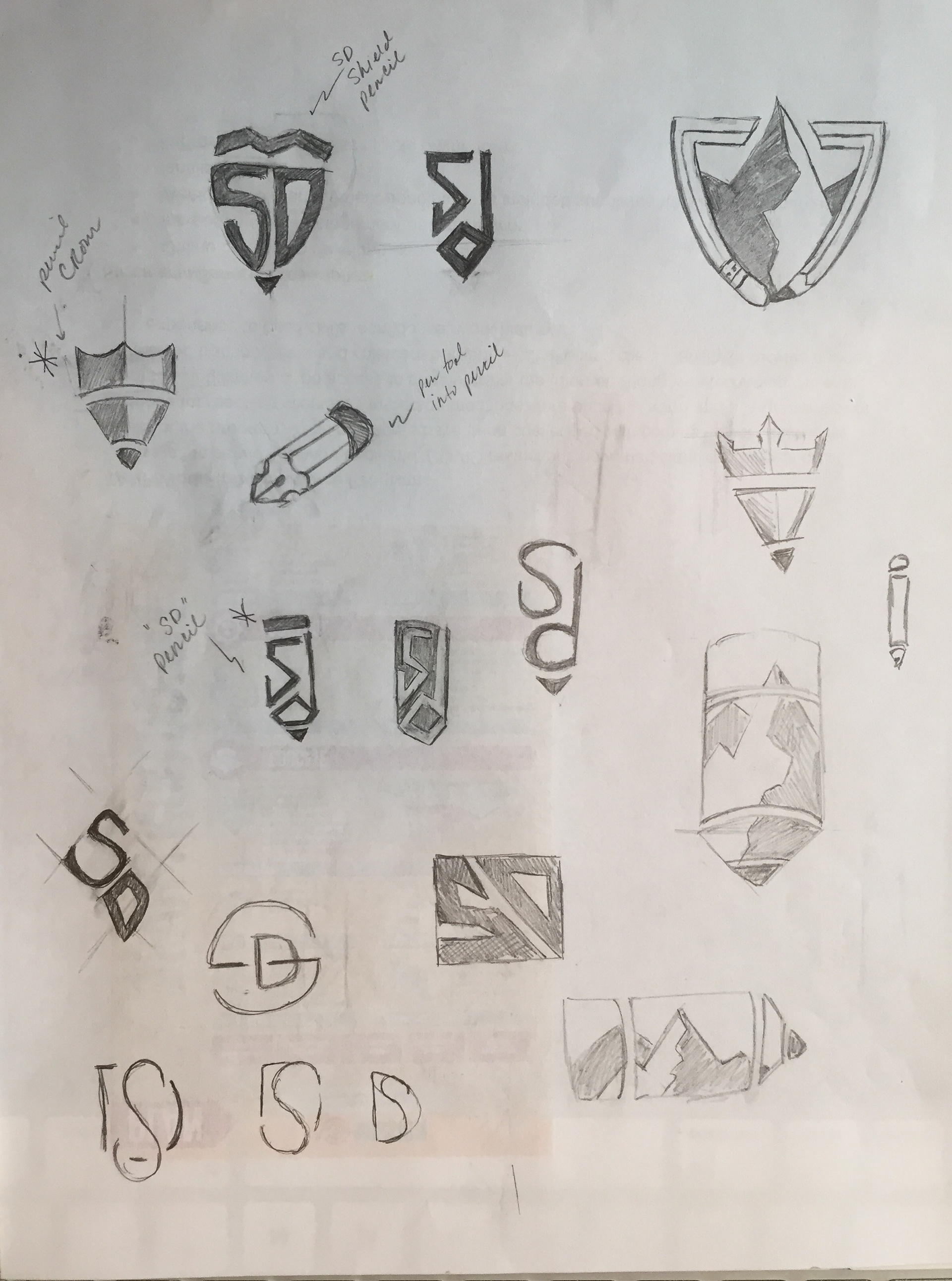
LOGO ICON
CROWN - to symbolize integrity
SHIELD - to symbolize loyalty
PENCIL - to symbolize creativity
Integrity - "the quality of being honest and having strong moral principles; moral uprightness". I will work hard to do be honest and do right by clients.
Loyalty - "giving or showing firm and constant support or allegiance to a person or institution". I believe in my clients. I believe in their business, their dreams, their products, and their services. I will work hard to see that the work I produce helps supports them and achieves their goals.
Creativity - "the use of the imagination or original ideas". I will produce creative, original work for my clients. I do not believe in stealing from other artists or designers and will not sacrifice integrity by doing so.
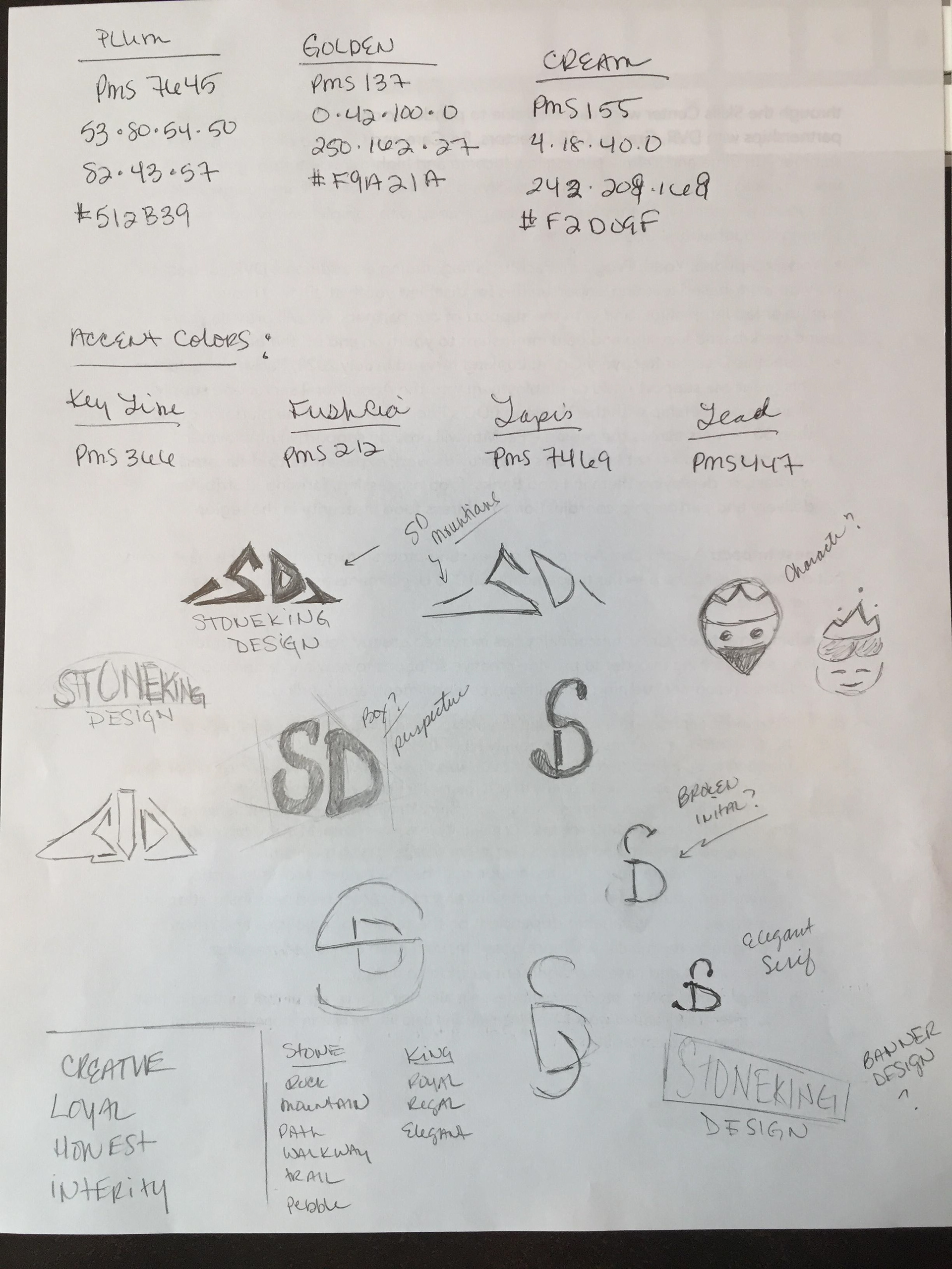
COLORS
PURPLE - the color of compassion, widom, and creativity
YELLOW - the color of freshness, optimism, and happiness
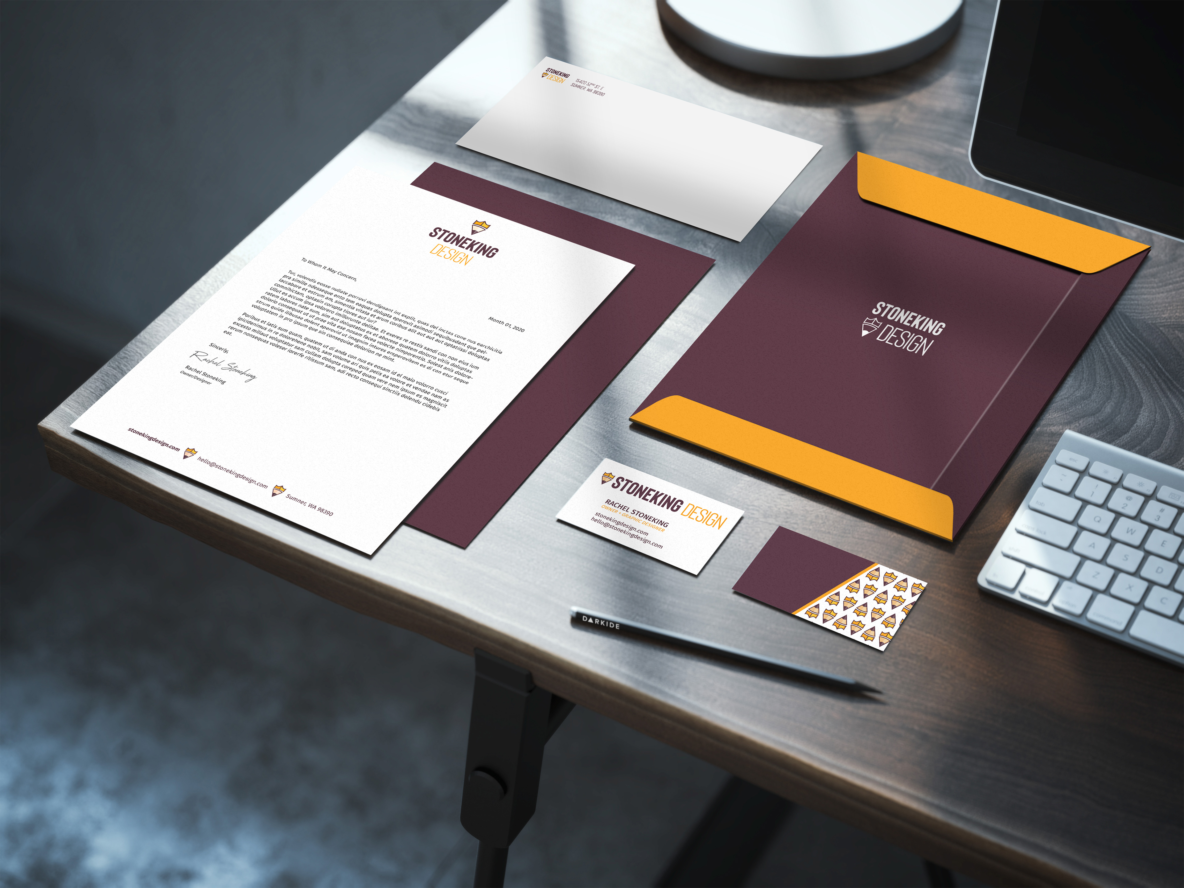
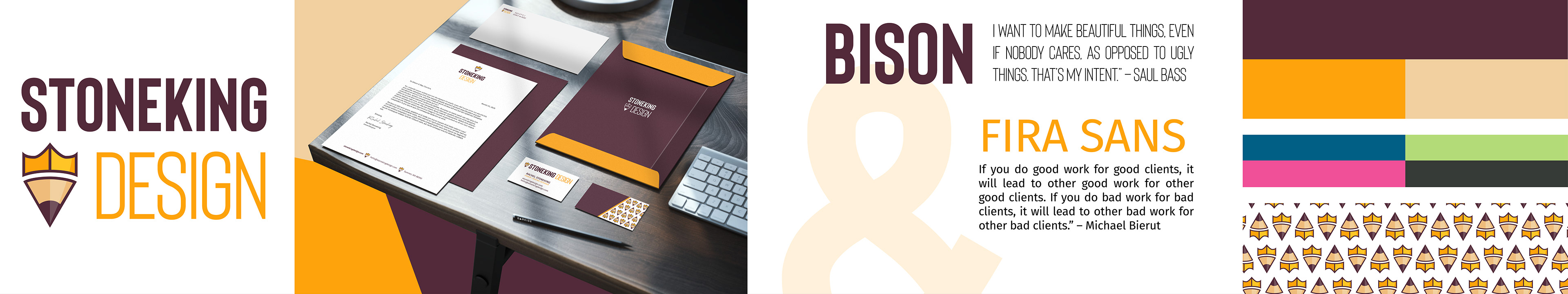
Business Stationary
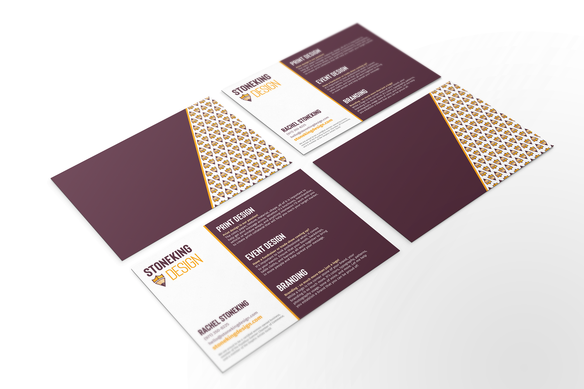
Capabilities Postcard - Concept Art
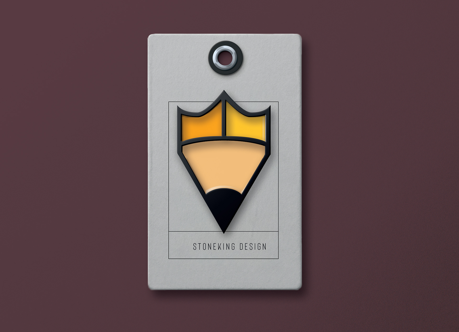
Enamel Pin Mockup
Stylescape
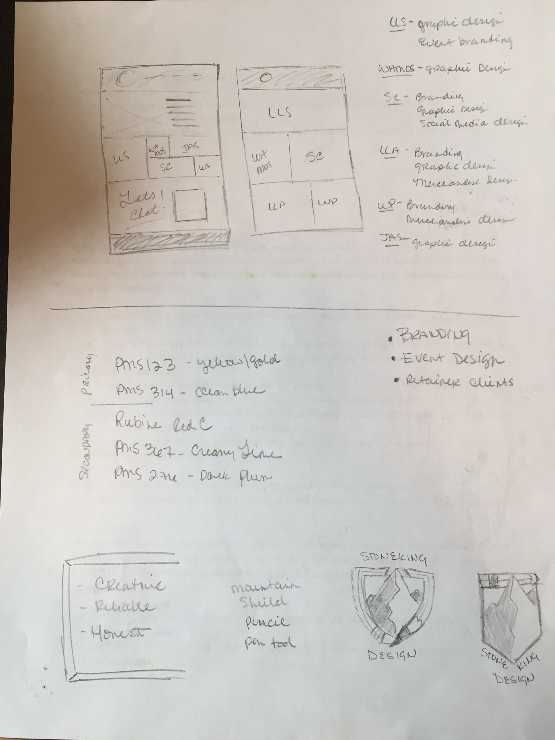
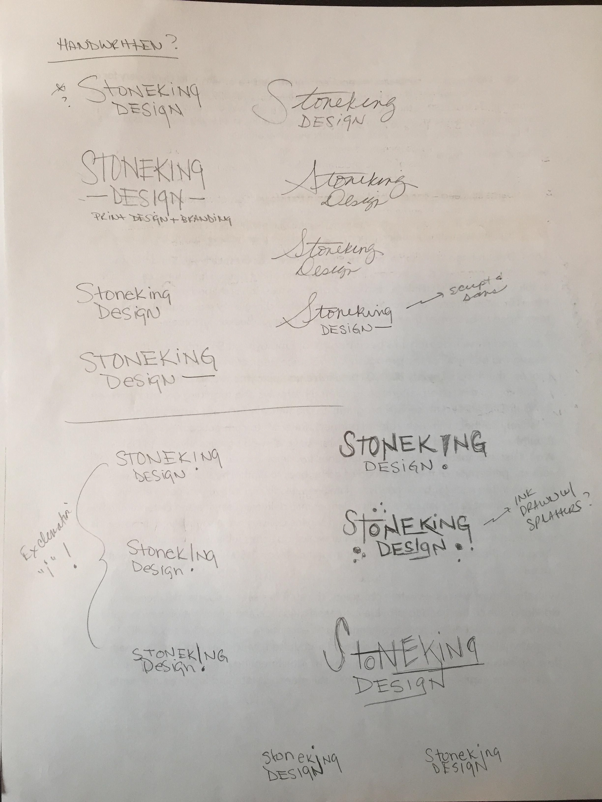
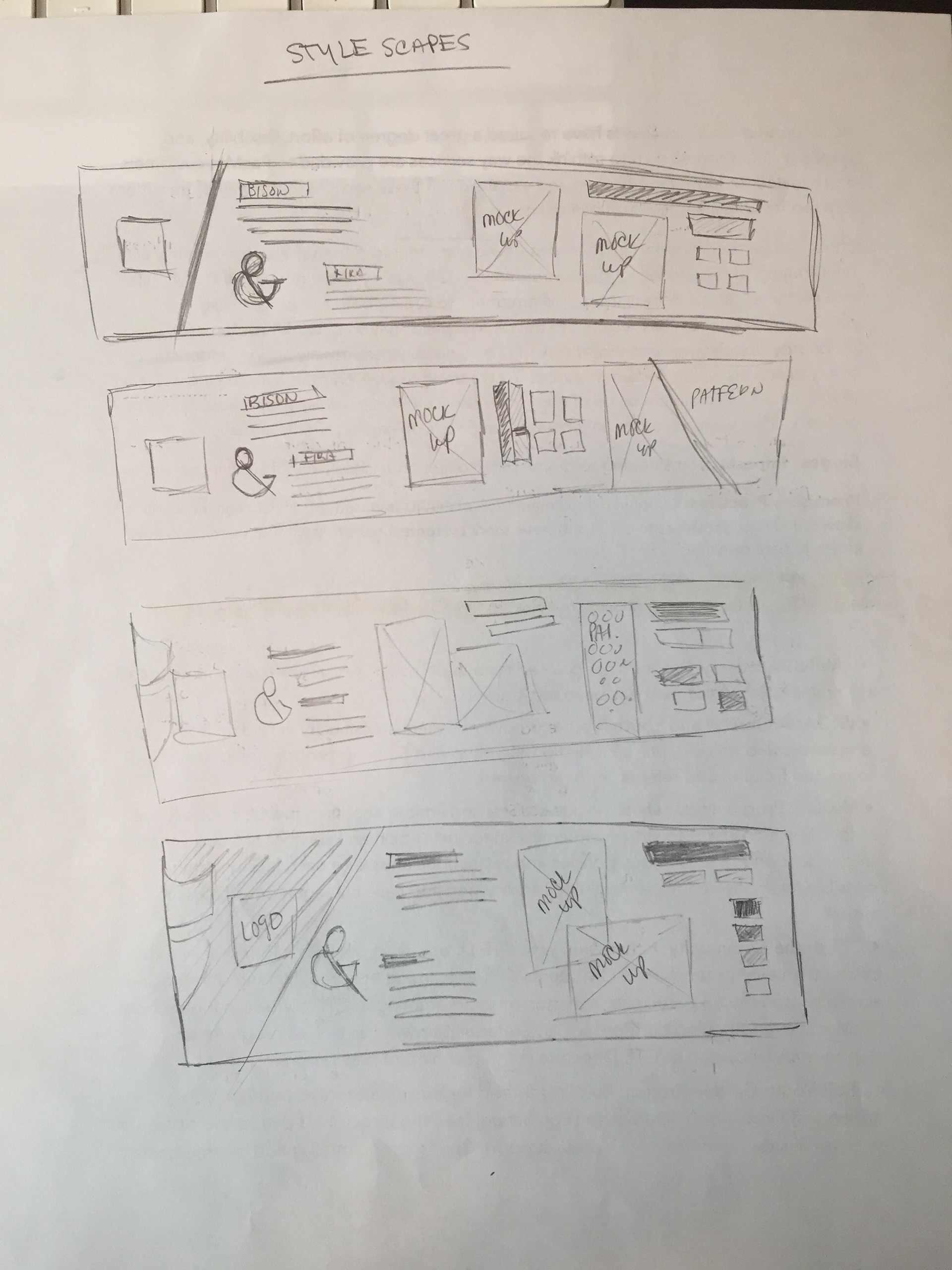
Sketches and Notes